Bella Rucci
✴
Bella Rucci ✴
Branding & Packaging for Bella Rucci
Client: Bella Rucci
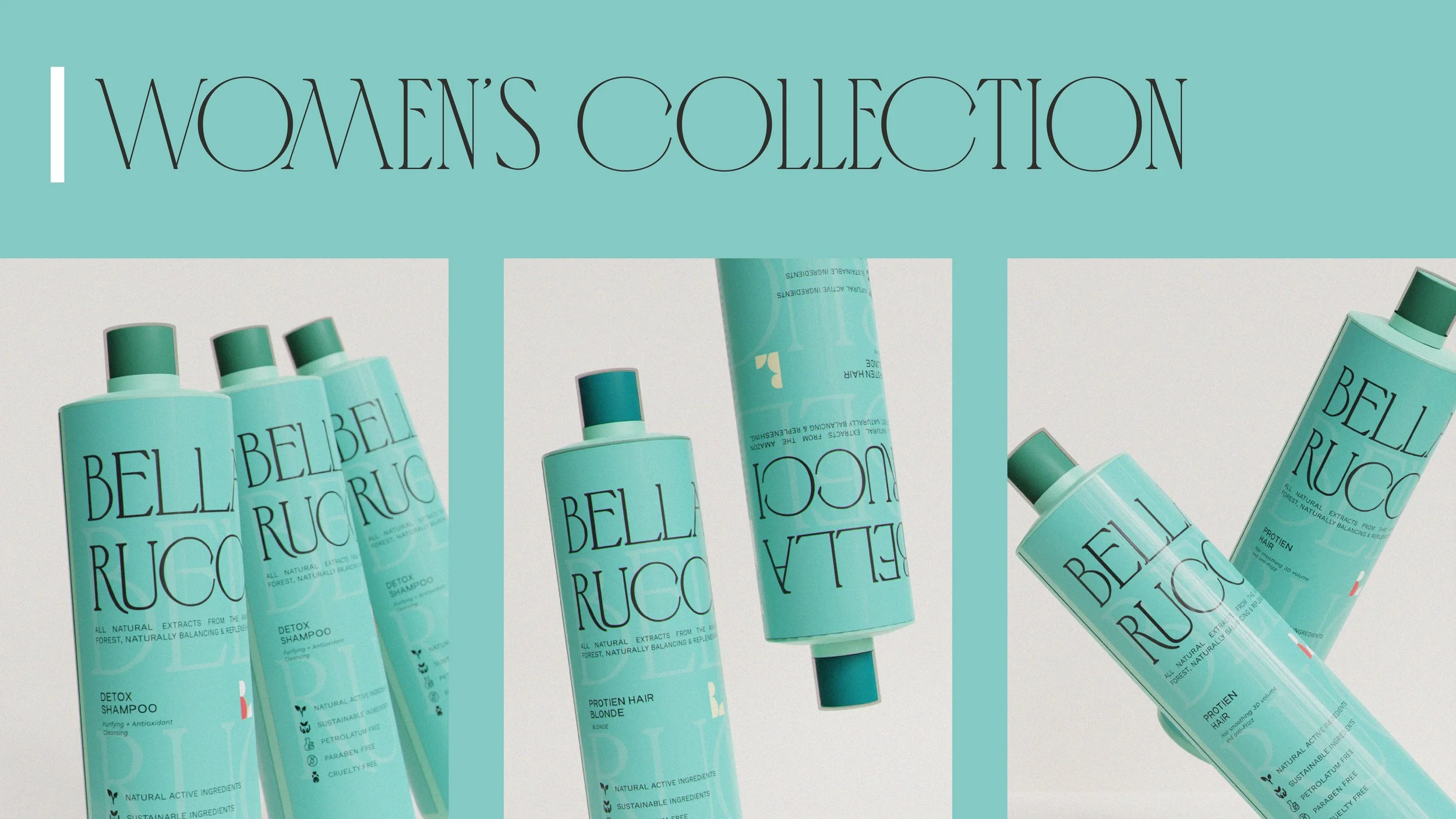
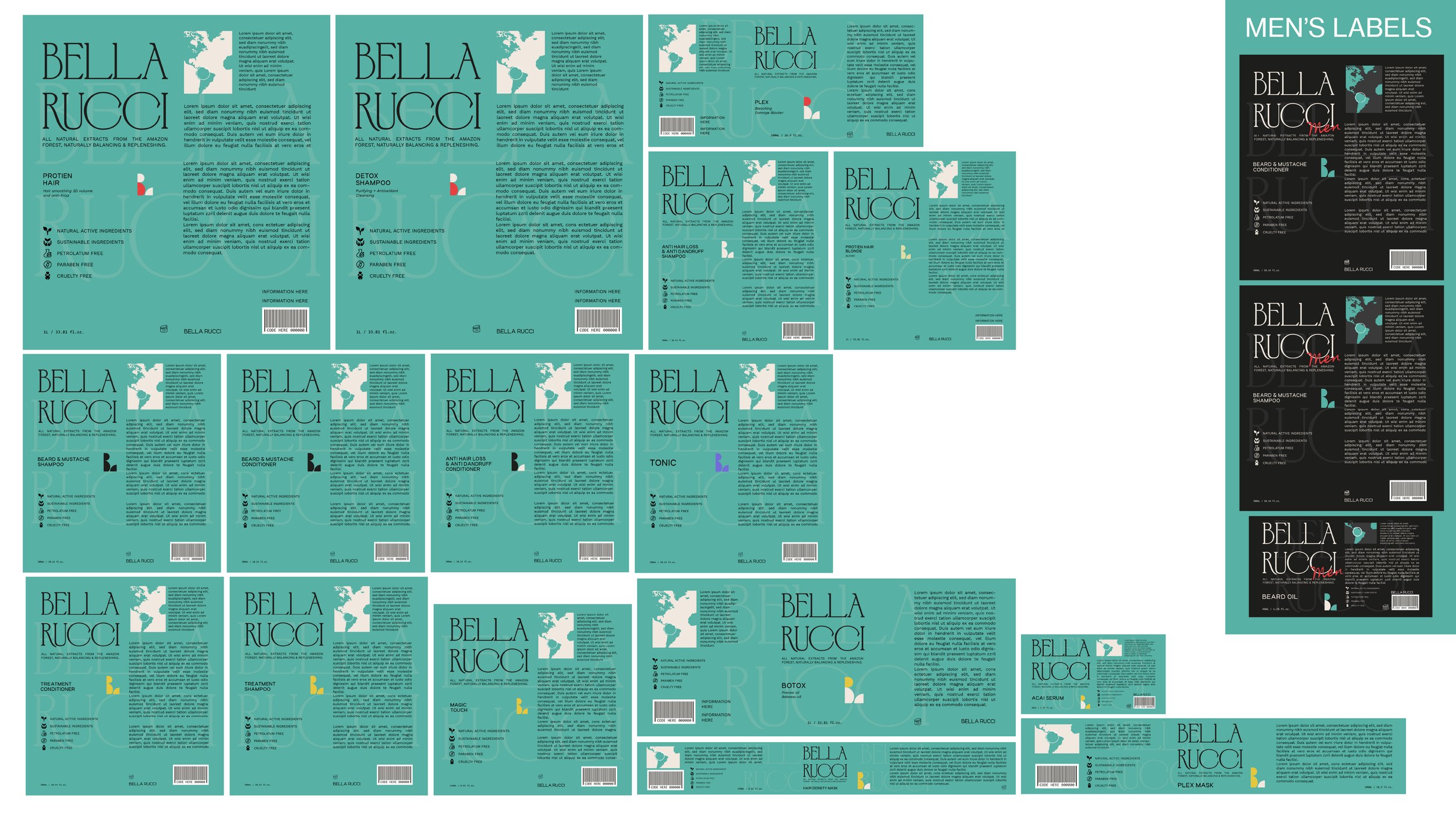
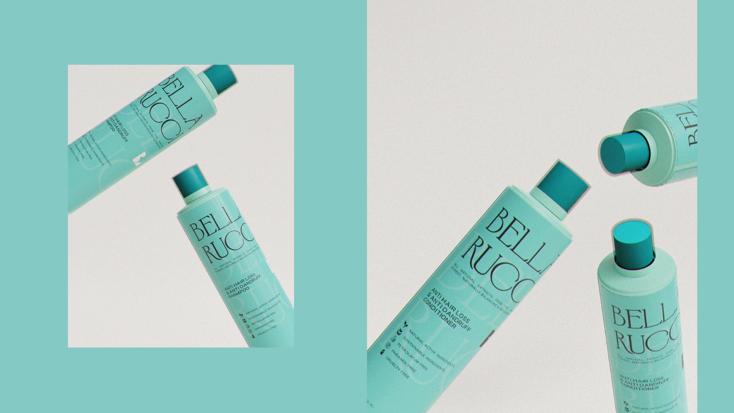
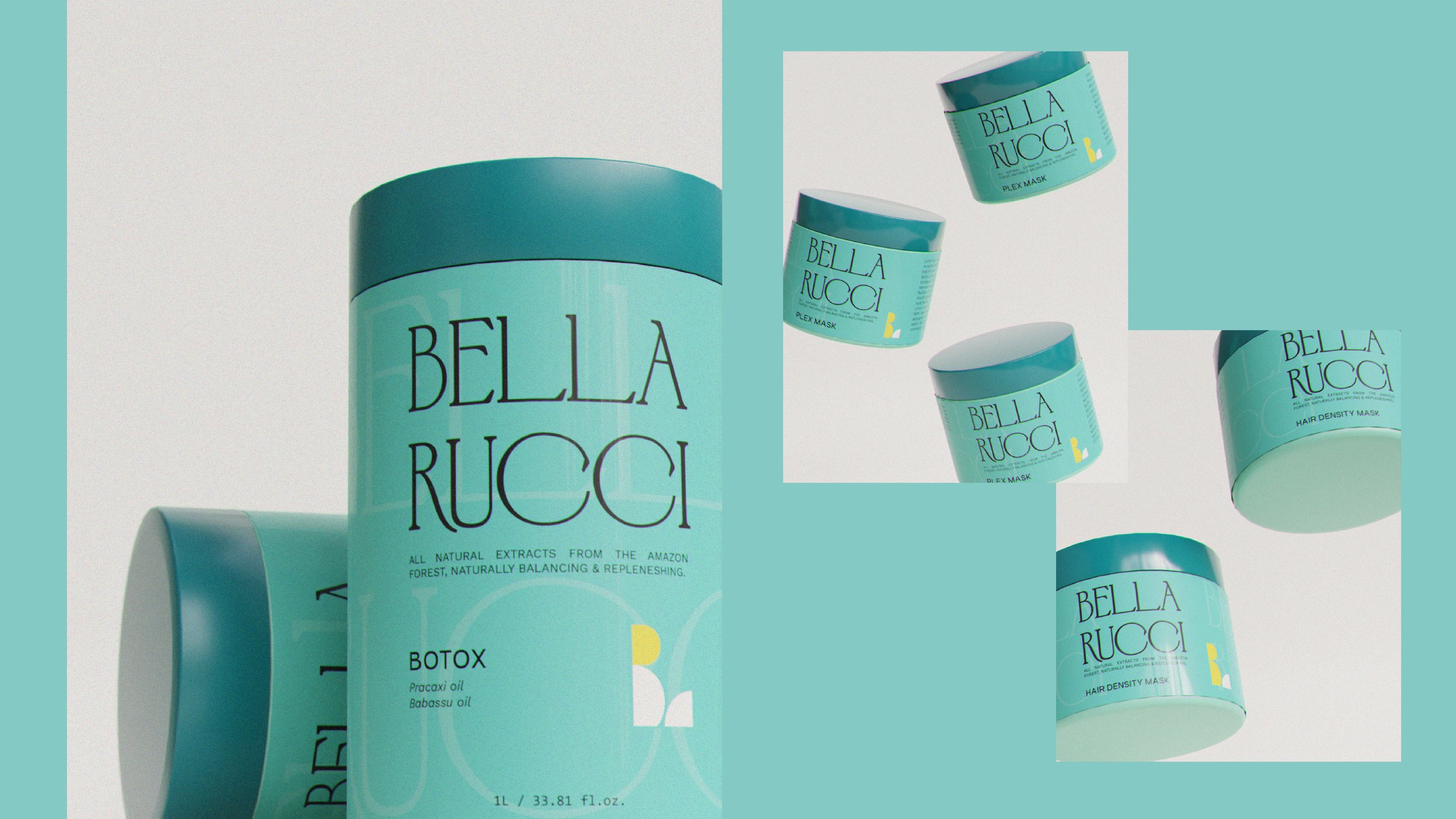
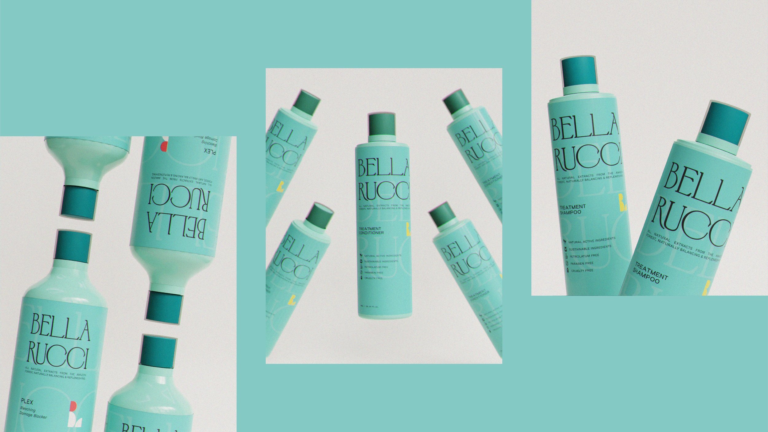
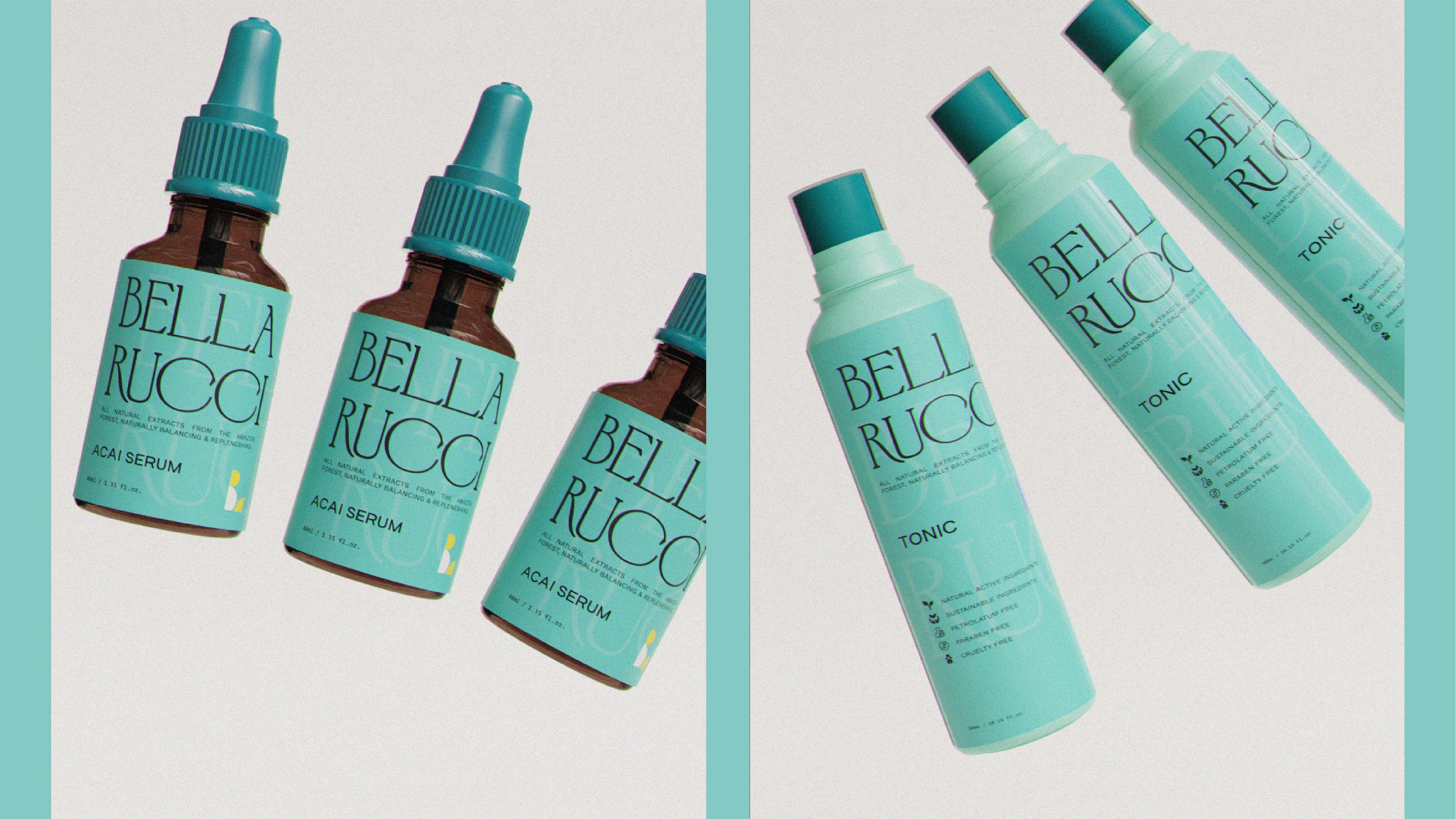
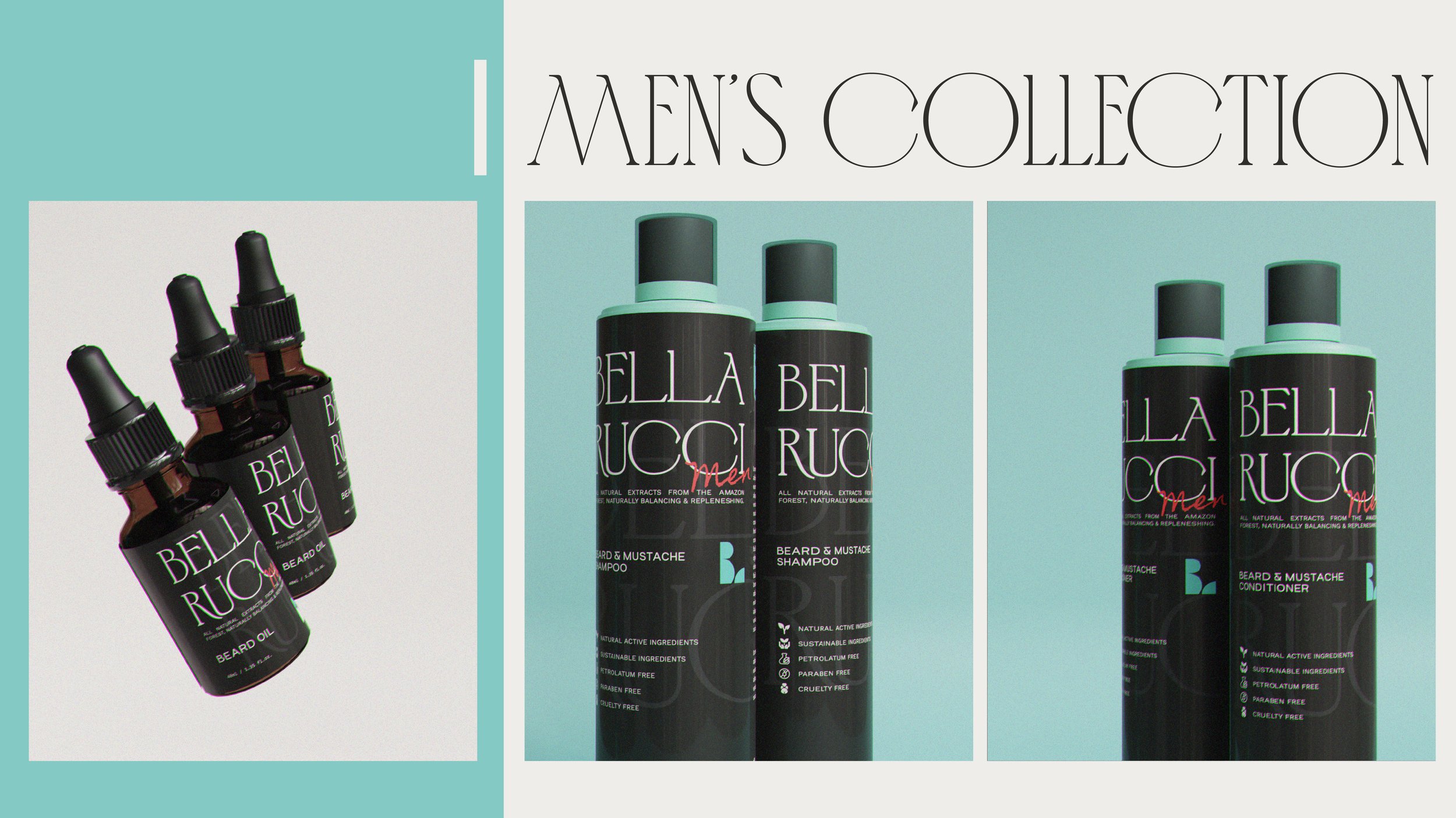
Bella Rucci is a hair cosmetics brand based in Brazil. While working with Bella Rucci, my responsibility as a graphic designer was to create a brand identity and packaging design that effectively communicates elegance, showcases the brand's use of natural extracts from the Amazon forest, and addresses specific hair problems that customers might have, all while maintaining a distinct design system.
To capture the essence of elegance, calmness, and luxury in the packaging design, I focused on utilizing a clean and sophisticated serif typeface. The chosen typeface features elongated letterforms with rounded serifs, adding a touch of refinement and elegance. The color palette underwent careful consideration, transitioning from a muted luxury green to a soothing baby blue. This change was made to convey a sense of comfort, cleanliness, and align with the theme of water and relaxation commonly associated with toiletries.
To differentiate the various products within the brand's lineup while maintaining a cohesive visual identity, I incorporated an icon mark. This icon mark cleverly represents the letters "B" and "r" of Bella Rucci, subtly connecting the branding elements and creating a recognizable symbol for the brand. The use of this icon mark adds a unique and memorable touch to the packaging design.
