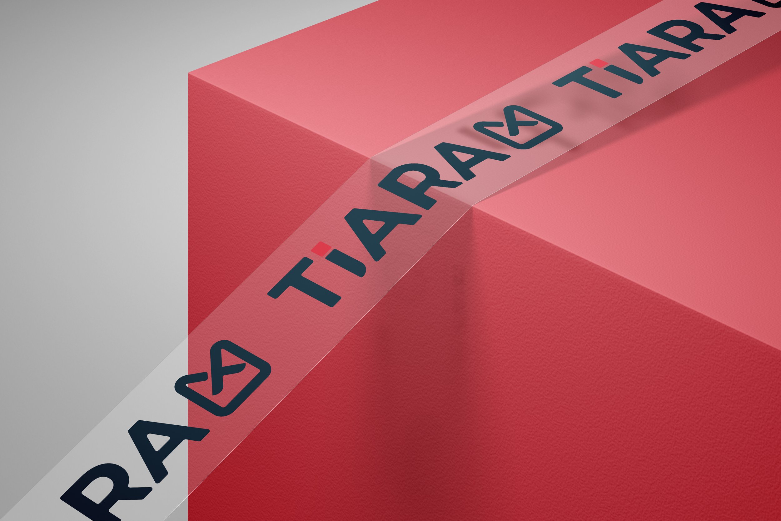
Branding for Tiara Real Estate
Client: Tiara Real Estate Agency
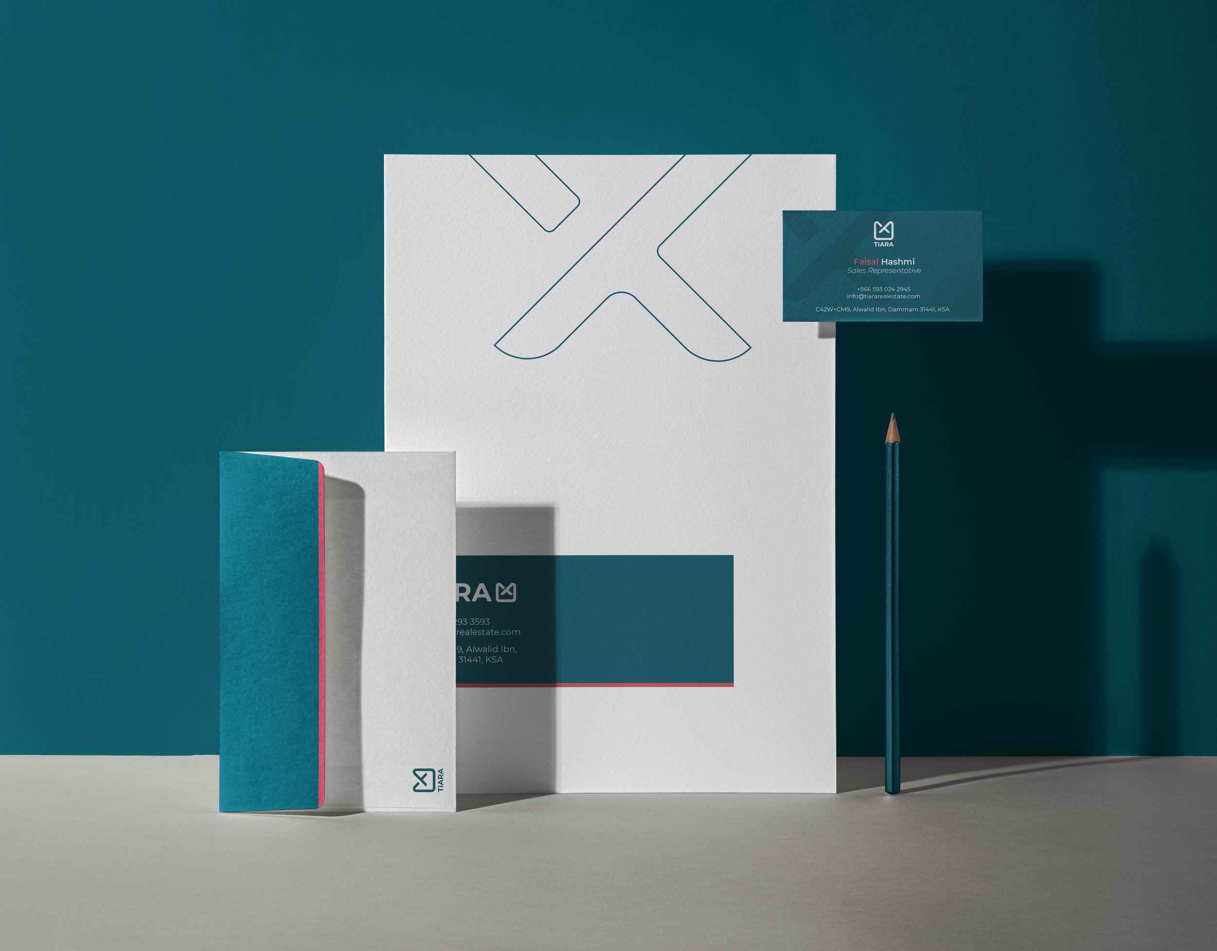
Collaborated with Tiara Real Estate to create a distinctive brand identity that stands apart in a saturated market filled with repetitive architectural motifs. The goal was to reflect the company's core values of kindness, care, and professionalism while establishing a unique and memorable presence.
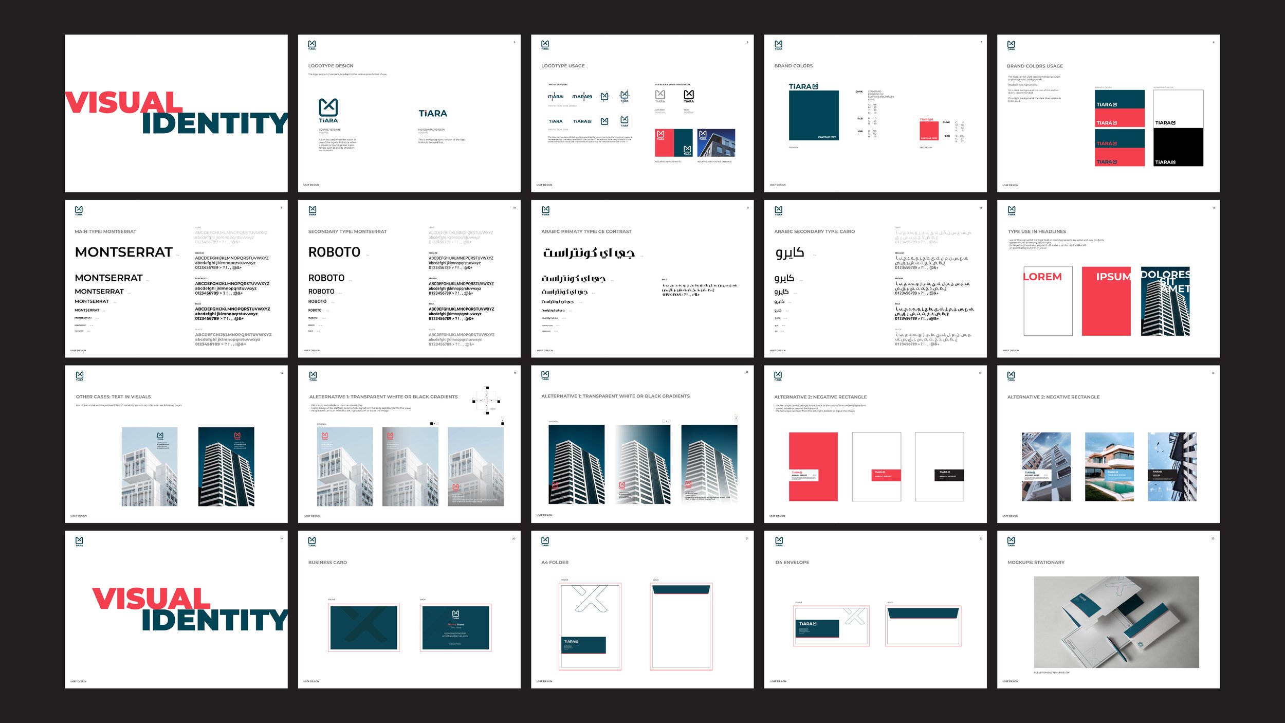
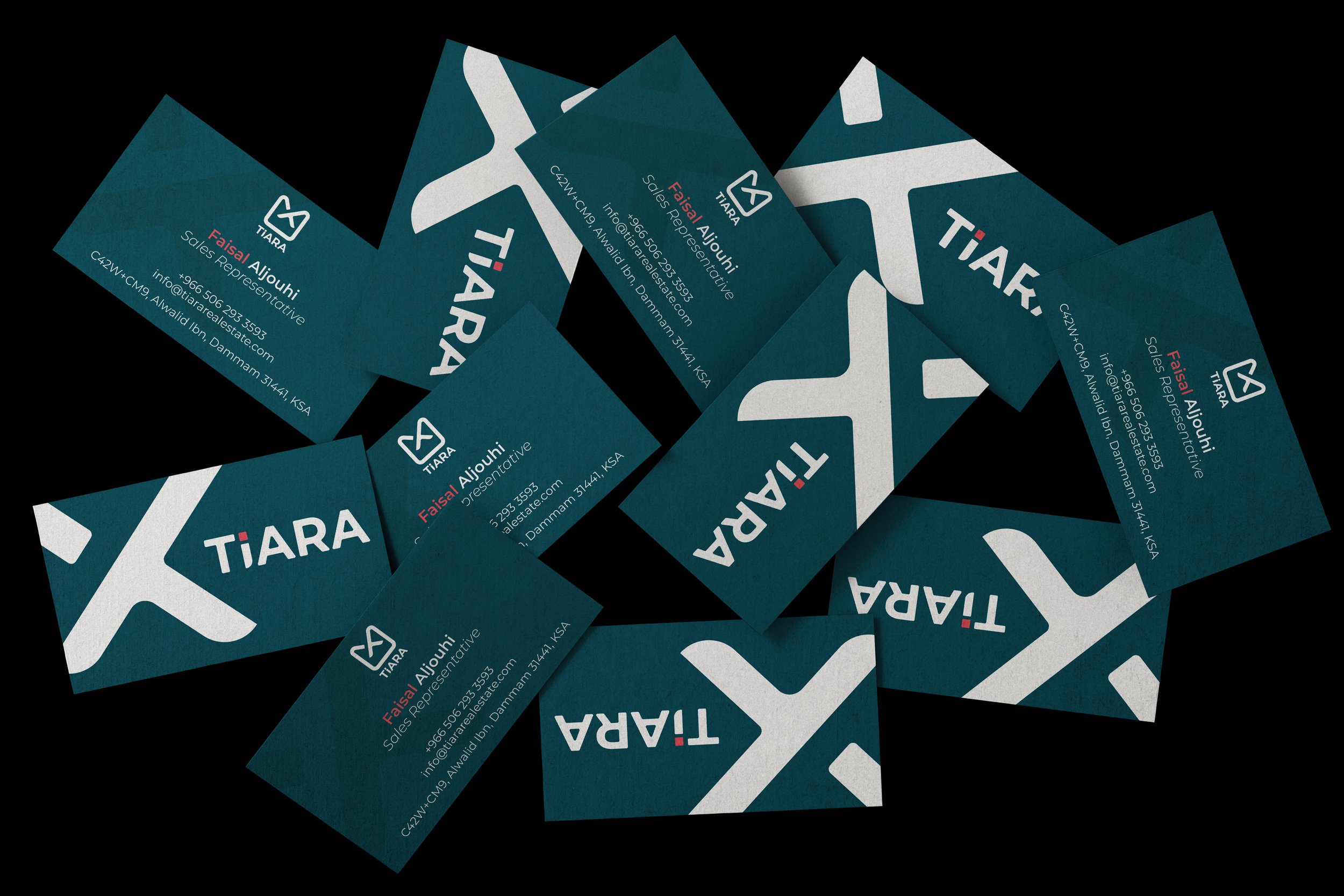
The logo design features a square divided by two intersecting lines, forming a shape that subtly incorporates the letters "Y" and "T"—a creative nod to the name "Tiara." This balanced and structured composition symbolizes the brand's core values of harmony and stability.
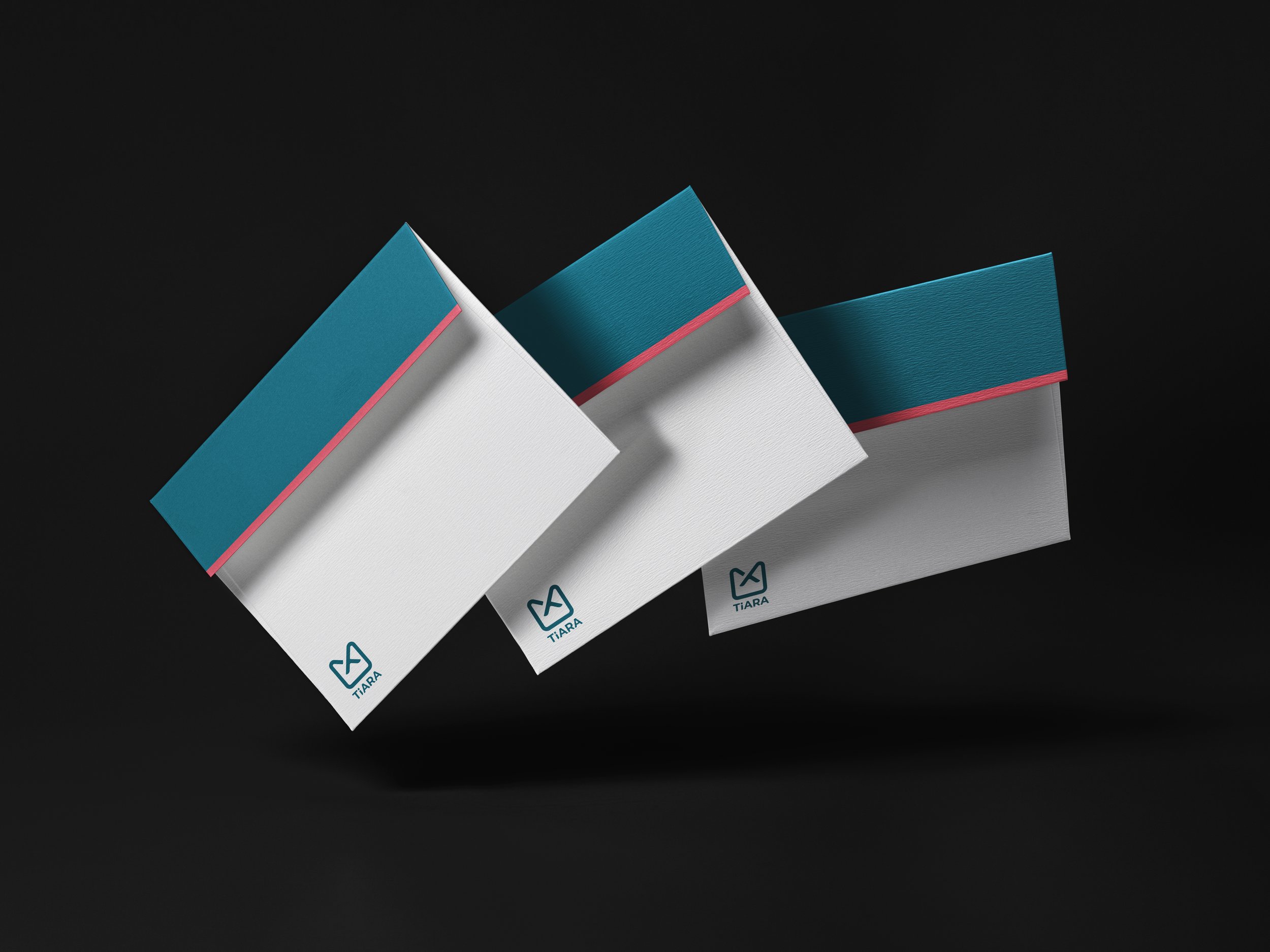
The color palette combines a dark desaturated blue to evoke tranquility, harmony, and confidence, with a secondary orange-red to represent honesty, warmth, and vitality. Together, these colors create a distinctive and meaningful aesthetic that resonates with the brand's mission.
