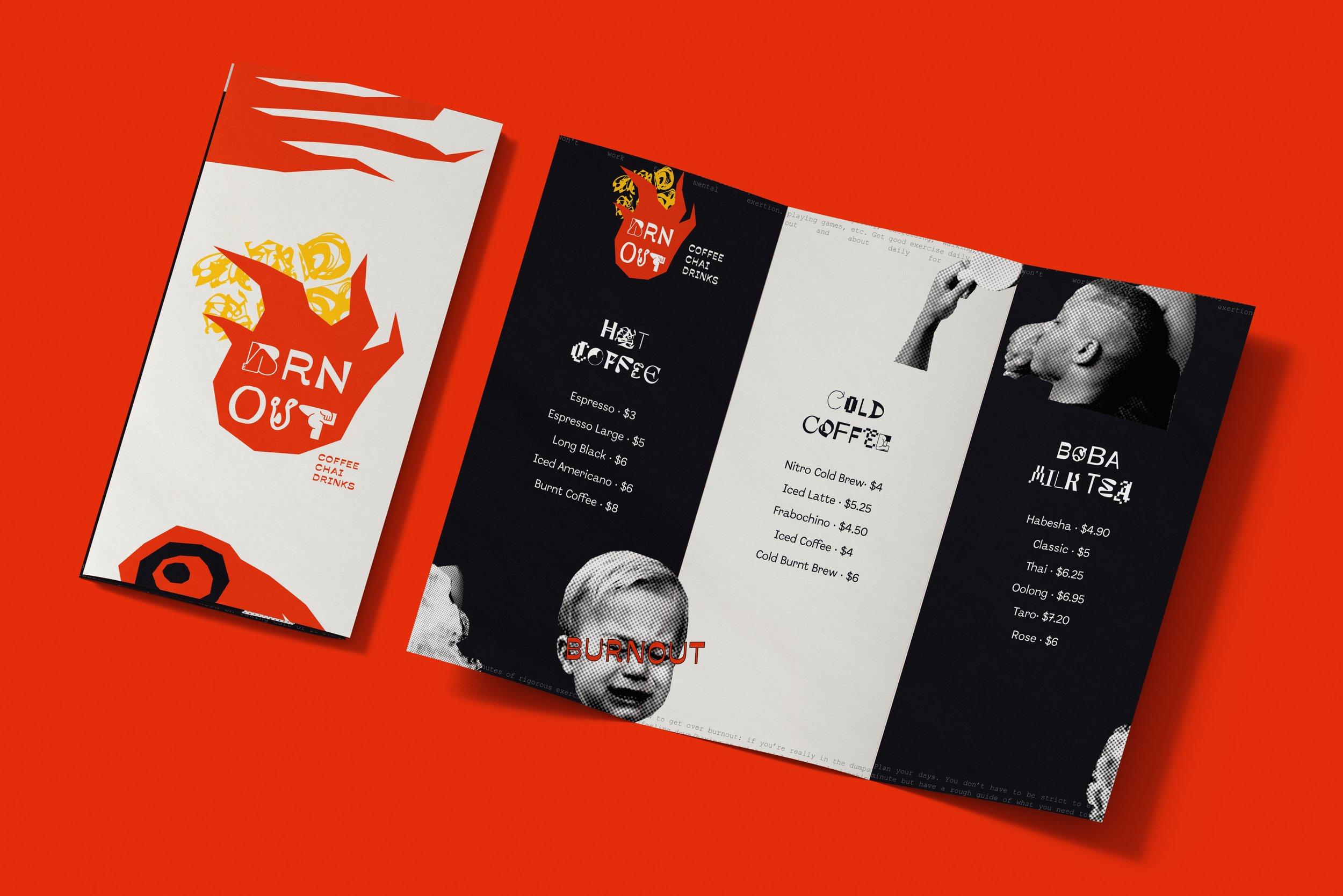
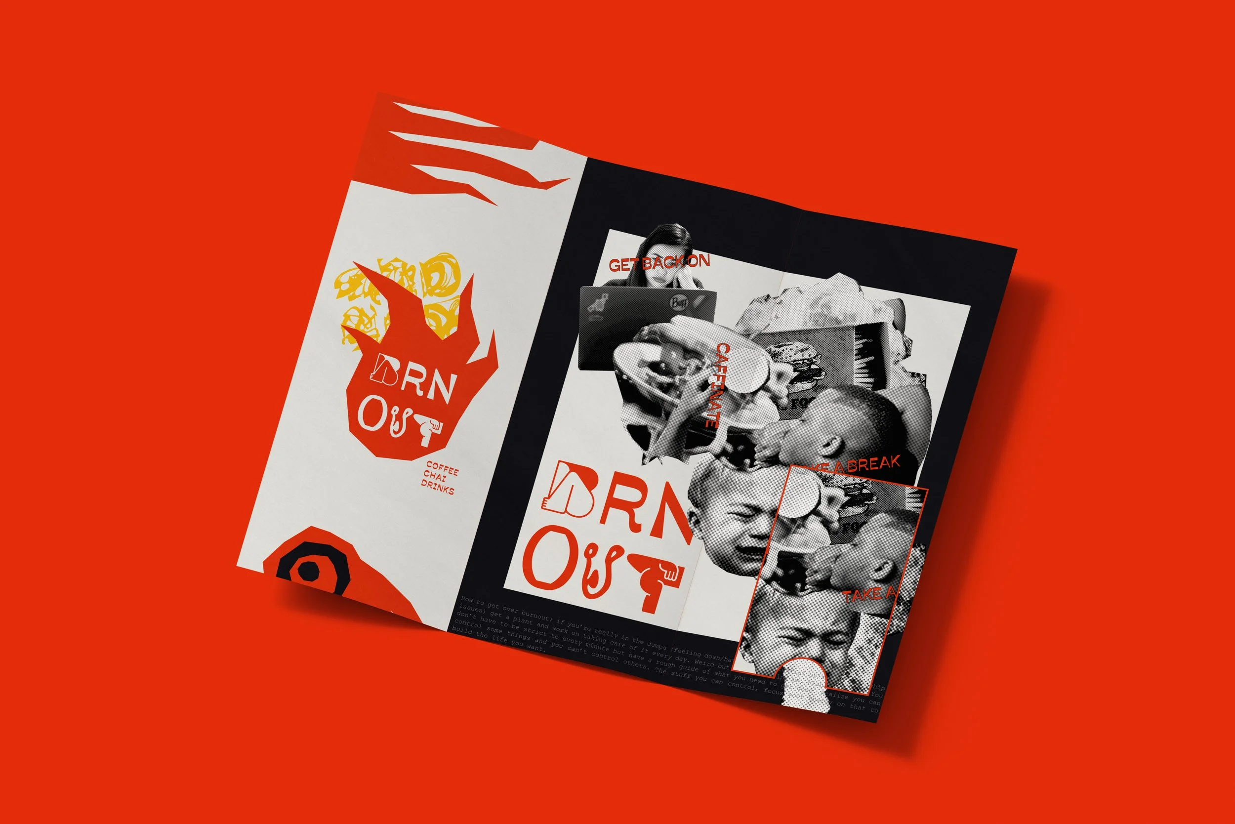
Brnout Cafe - Branding & Menu
This assignment was a challenge to create a menu for a conceptual food/drink shop of our imagination, my concept revolved around a feeling all artists are familiar with, Burnout, and all the caffeine, rage and frustration that comes with it.
The concept behind the design is to be expressive, bold, and truly represent how the term "burnout" feels. To achieve this, I employed a striking color palette consisting of contrasting red, yellow, and black tones. These colors evoke the intense emotions associated with burnout, reflecting the passionate energy and emotional turmoil that individuals in this state often experience.
Typography plays a pivotal role in conveying the artistic feeling of burnout. In this design, I utilized bold and expressive typography that goes beyond its traditional role. It becomes more symbolic than typographic, visually representing the struggles and resilience of individuals facing burnout. The letterforms themselves exude creativity and intensity, capturing the essence of the artistic journey and sparking a sense of inspiration in the viewer.
By fully embracing the burnout audience, Brnout Cafe serves as a haven for those in need of recovery and rejuvenation. The menu design becomes a visual representation of this mission, empowering customers to take a moment for themselves.